Quest Rebrand
In 2017, Quest Nutrition was in an interesting position. After several years of hectic, explosive growth, the company was ready to make the step from wild start-up to mature CPG. The owners had appointed a new CEO, we had exciting new products on the horizon, and a new Creative Director - me!
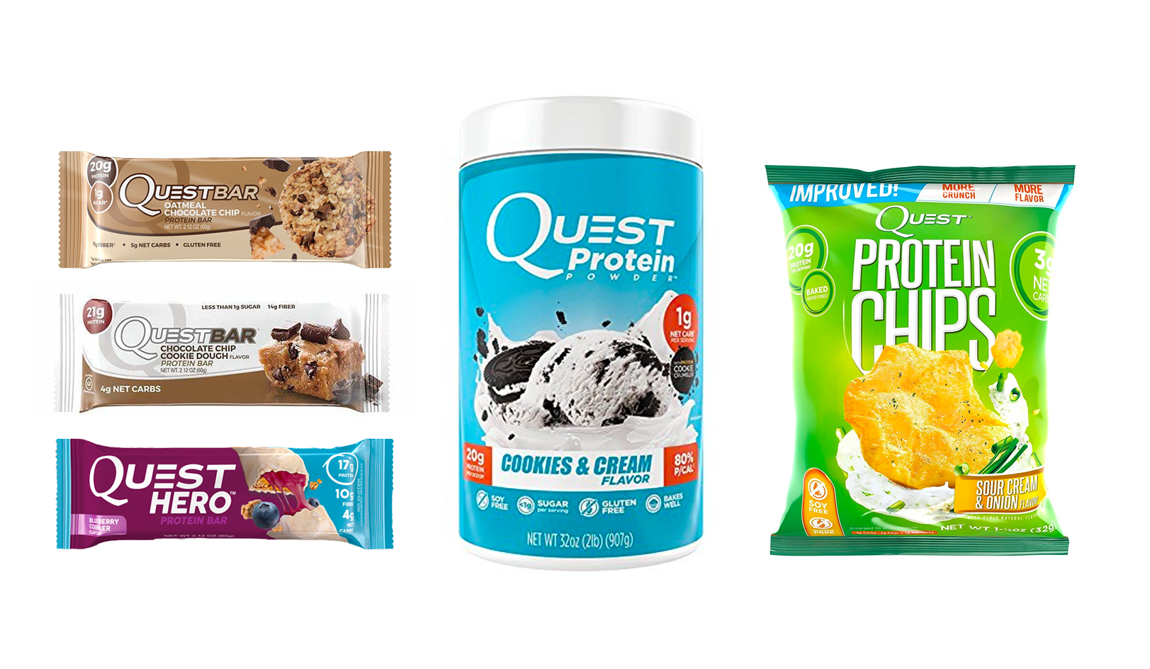
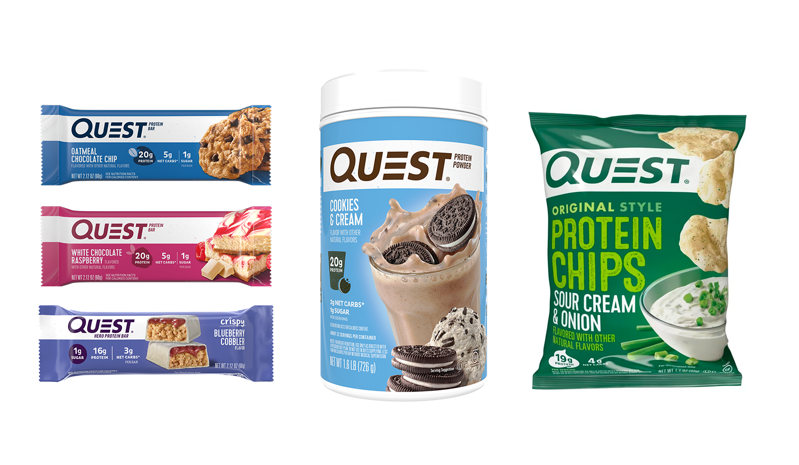
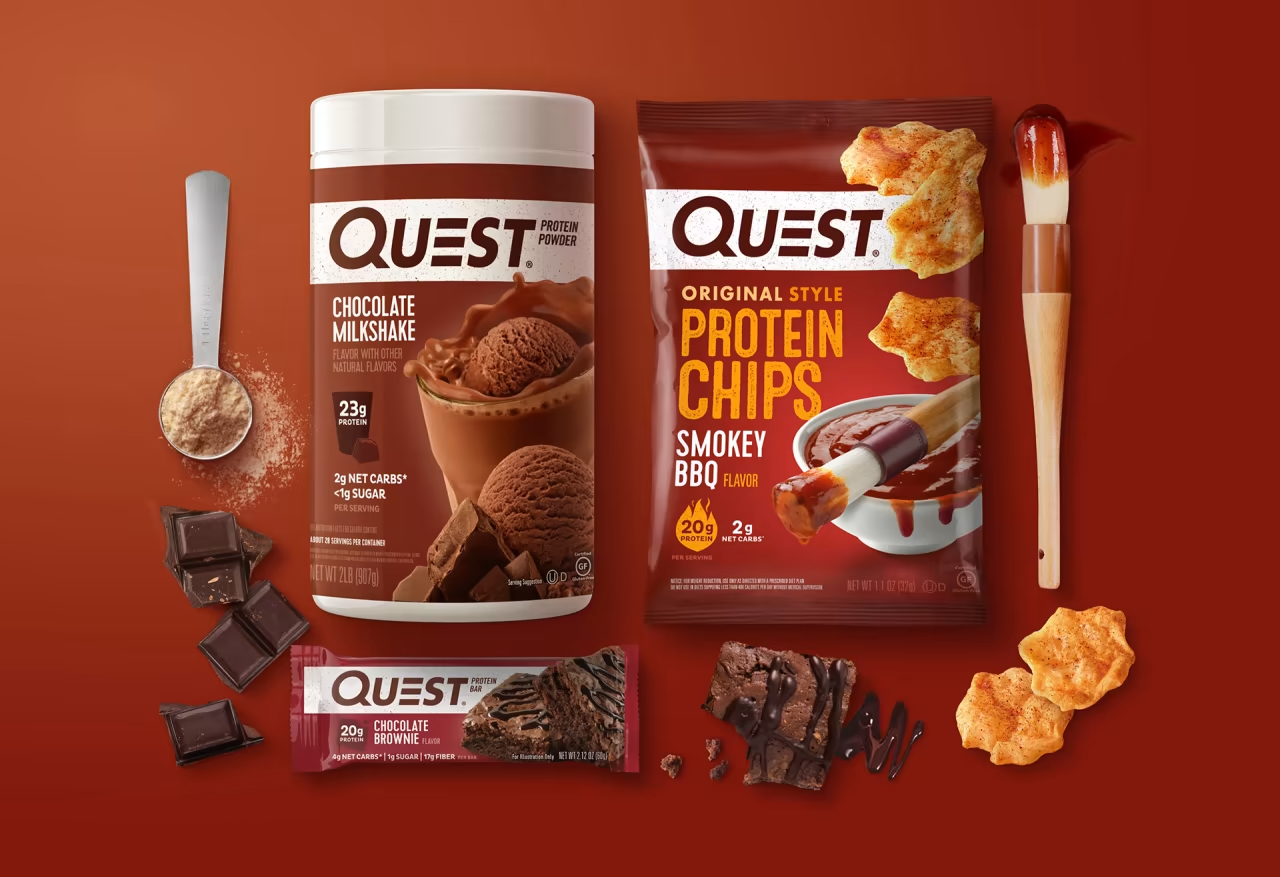
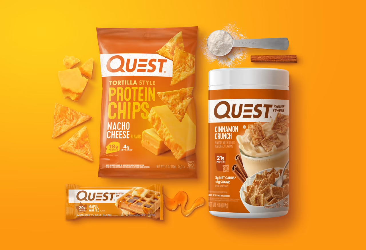
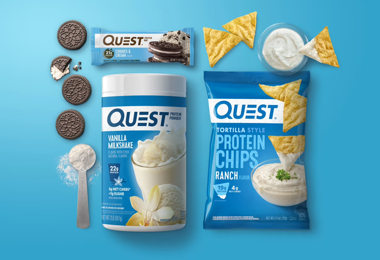
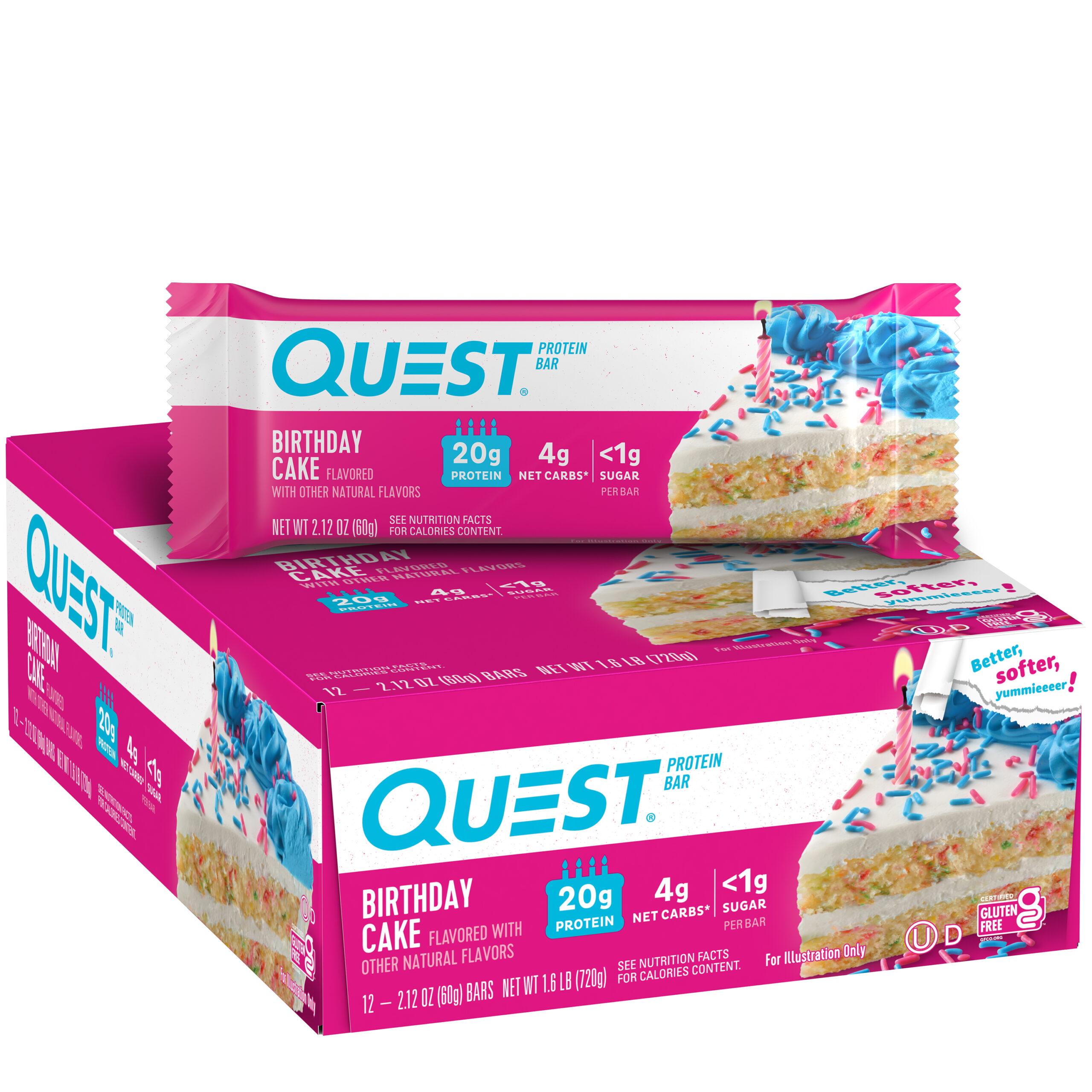
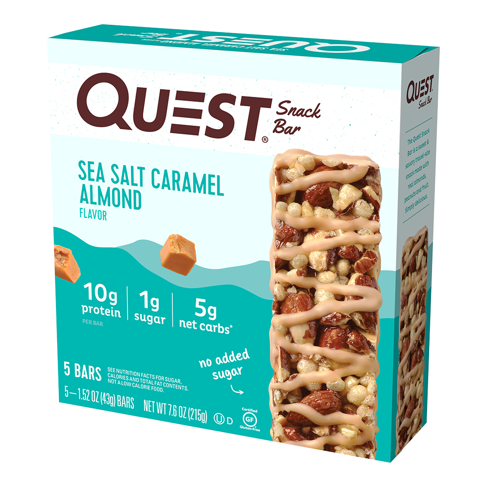
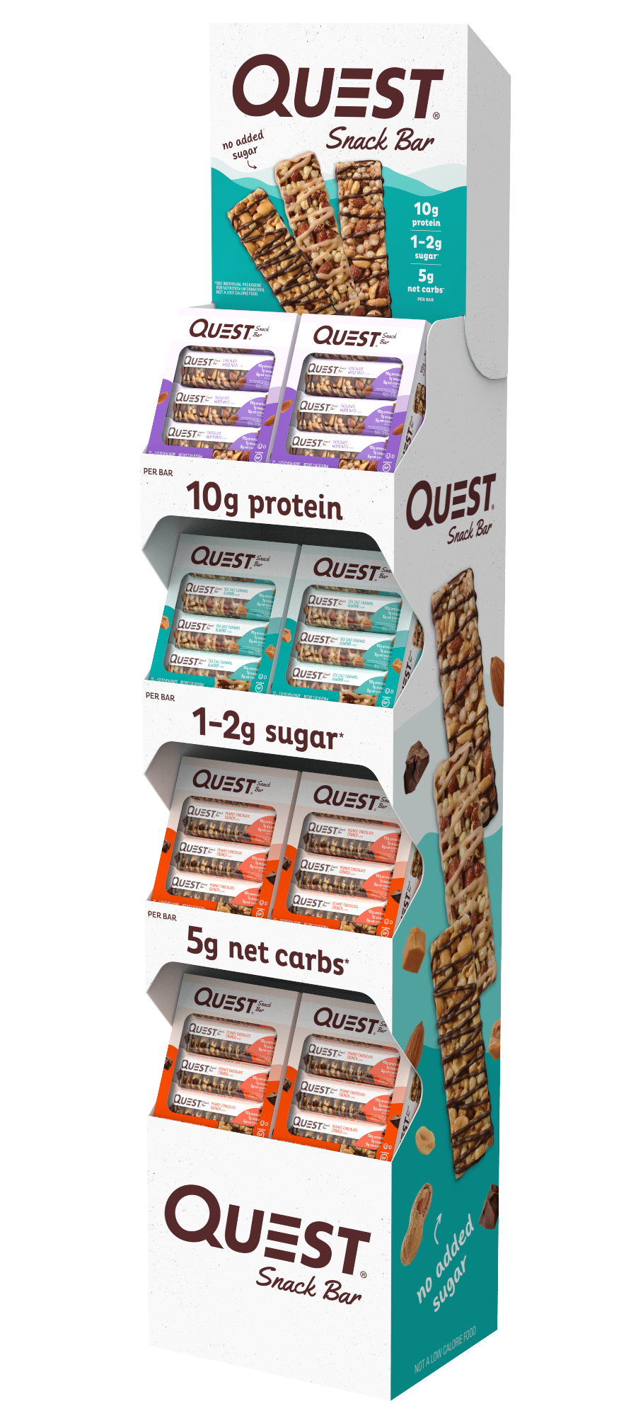
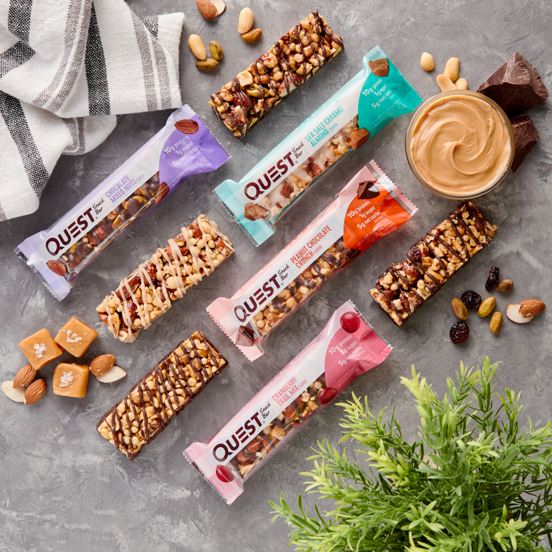
Our first priorities for redesign were the packaging and logo. As always happens naturally as brands add flavors, products and sub-lines, the packaging system had drifted apart and was wildly inconsistent. Not only that, we lacked a bold identity that would cut through on shelf and form a compelling brand block. Findability was a problem, and the flagship protein bar line was a flurry of swooshes, bursts, gradients, stock photos, and serifs.
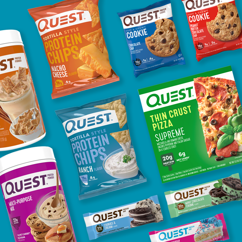
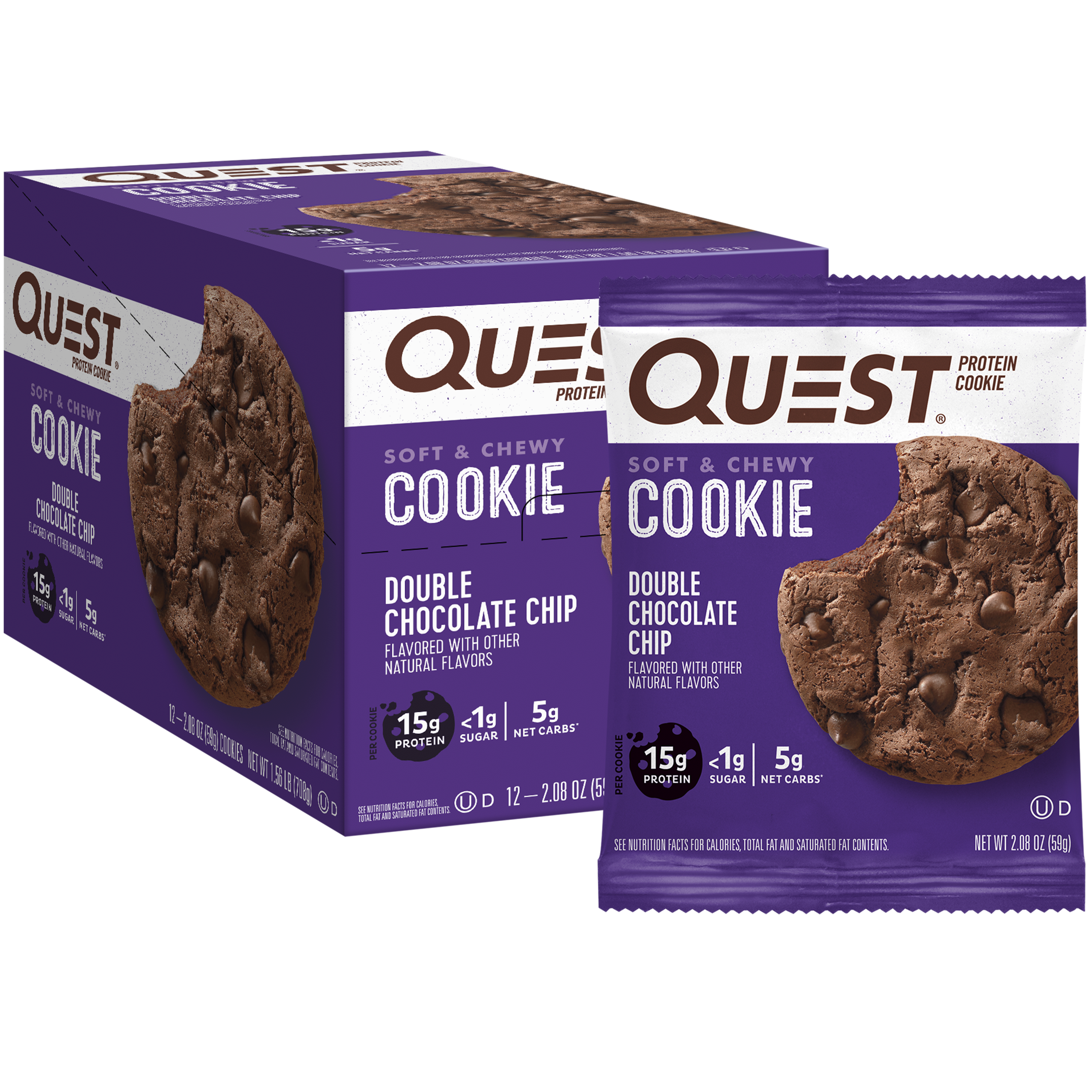
We enlisted Chase Design Group to develop a new design system that would tie all of our product lines together, and I worked with the Chase team and our in-house artists to apply the look to all 200+ pieces of artwork.

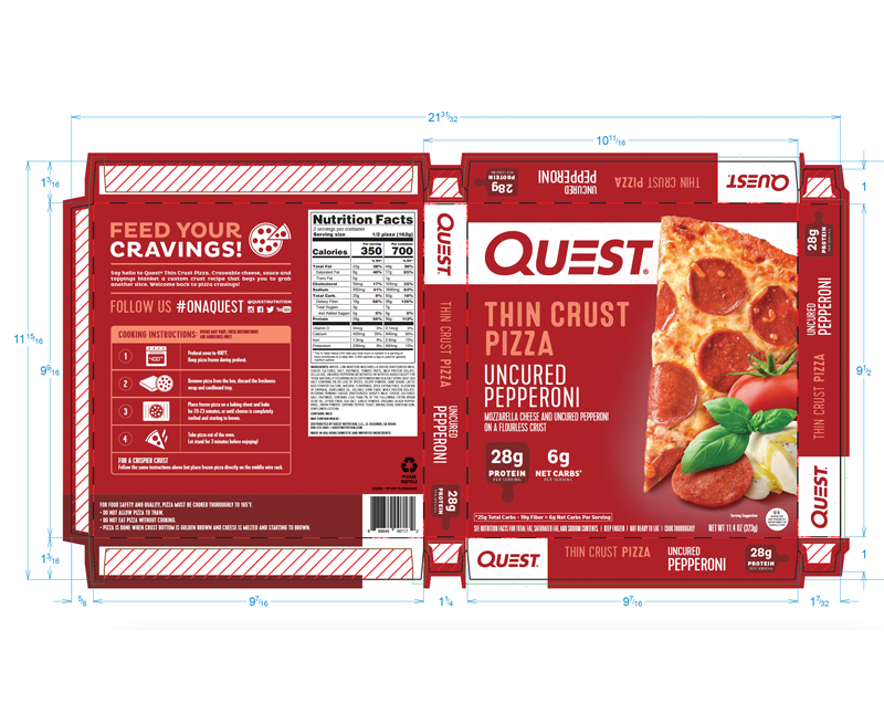
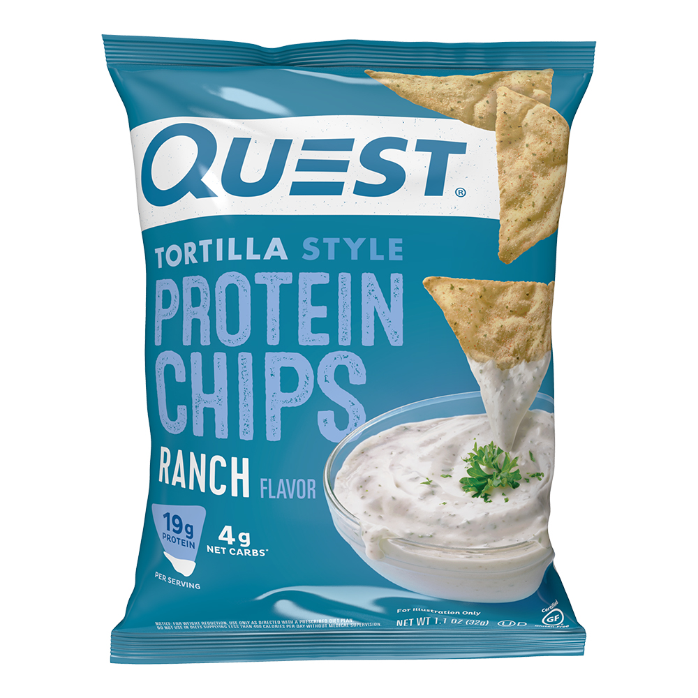
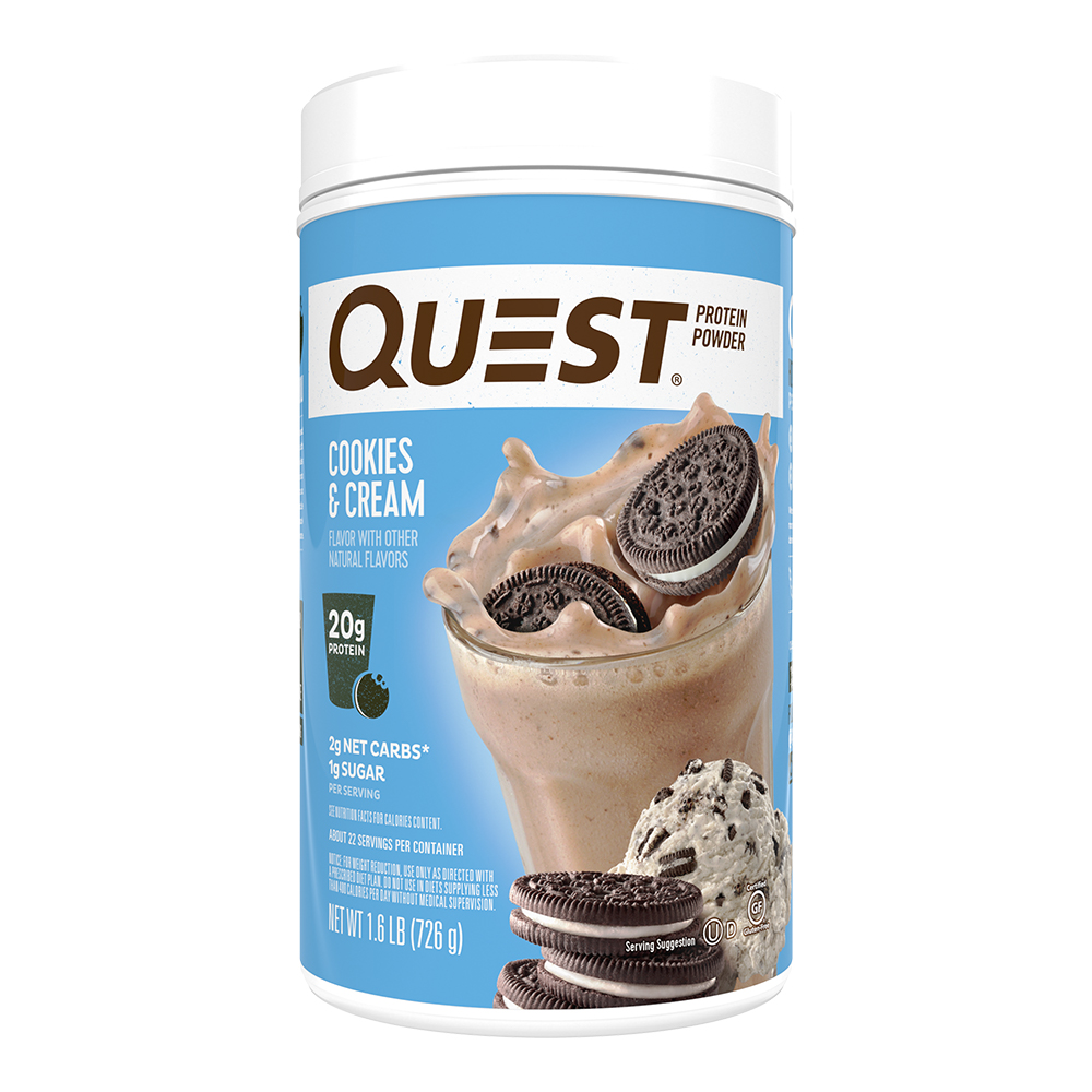
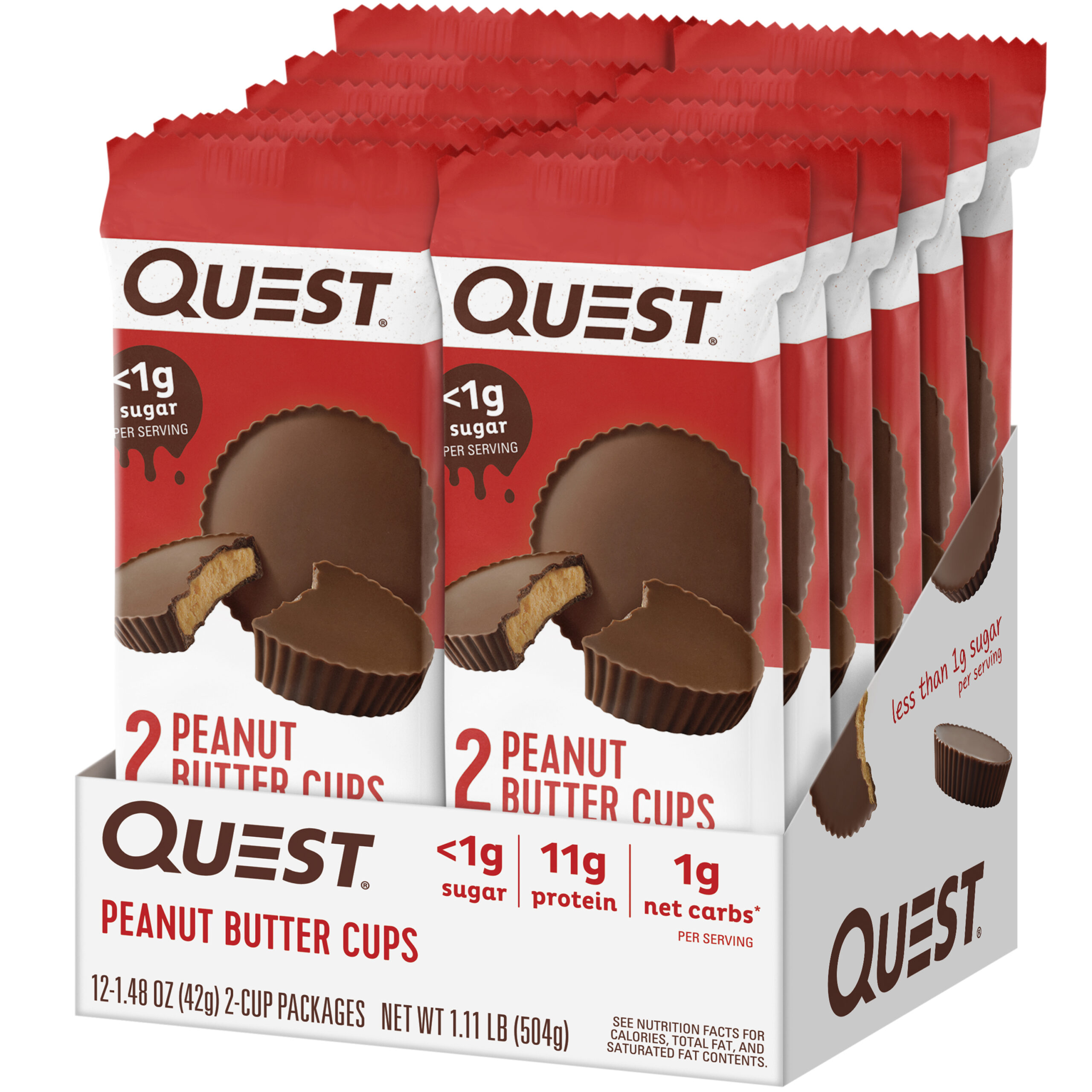
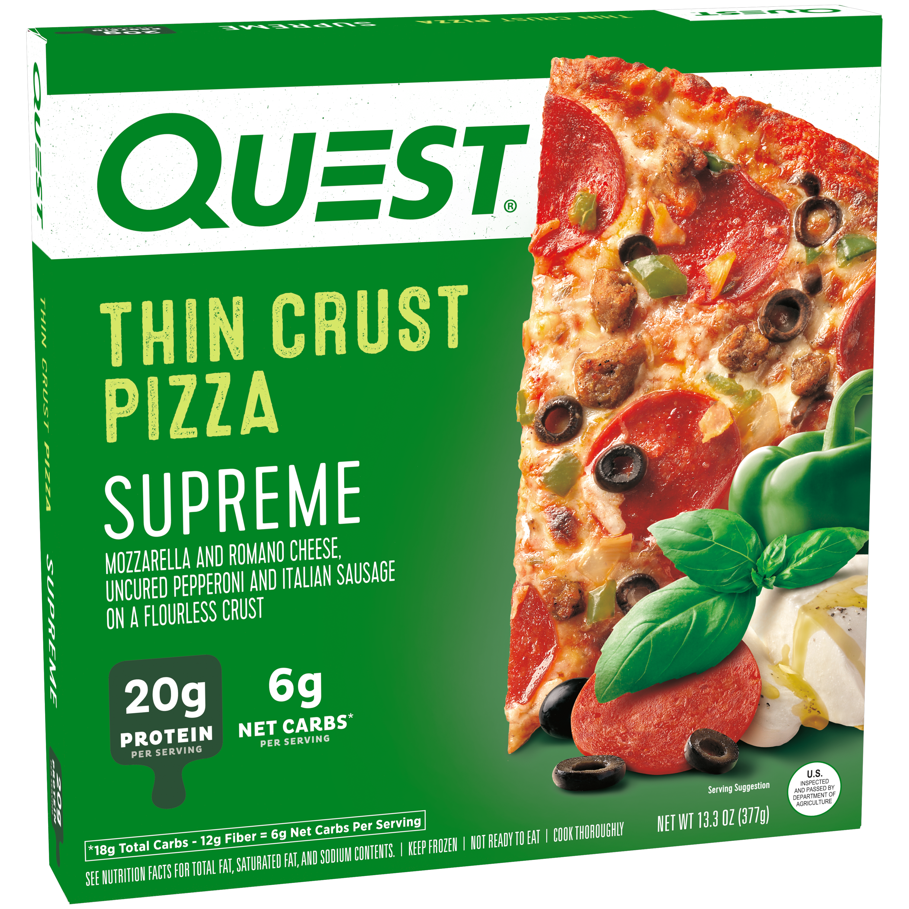
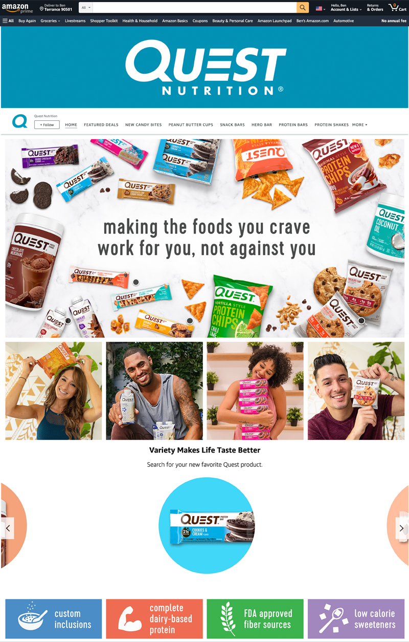
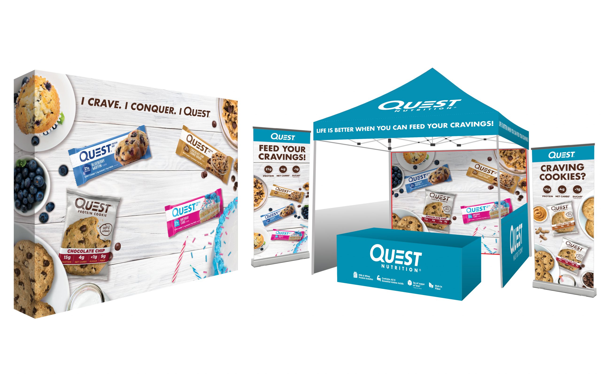
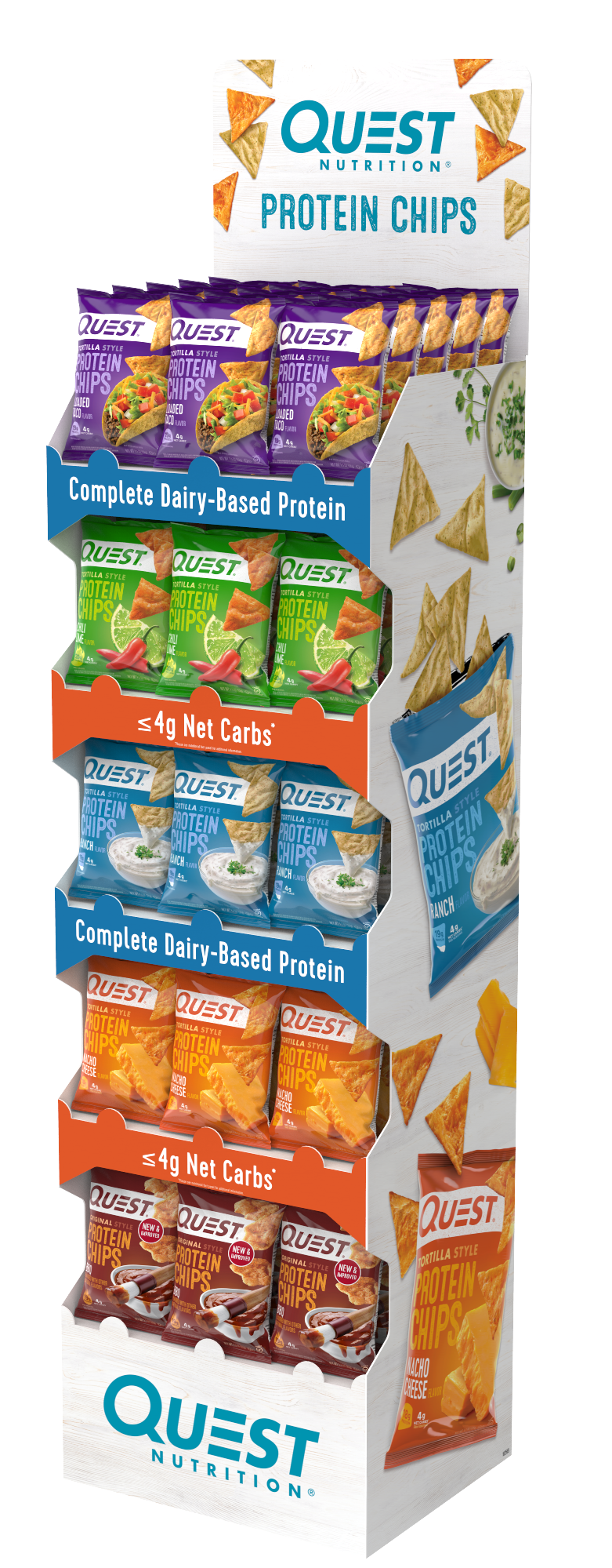
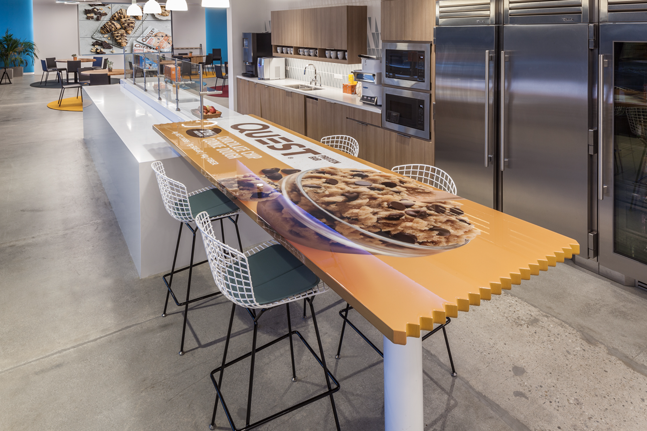
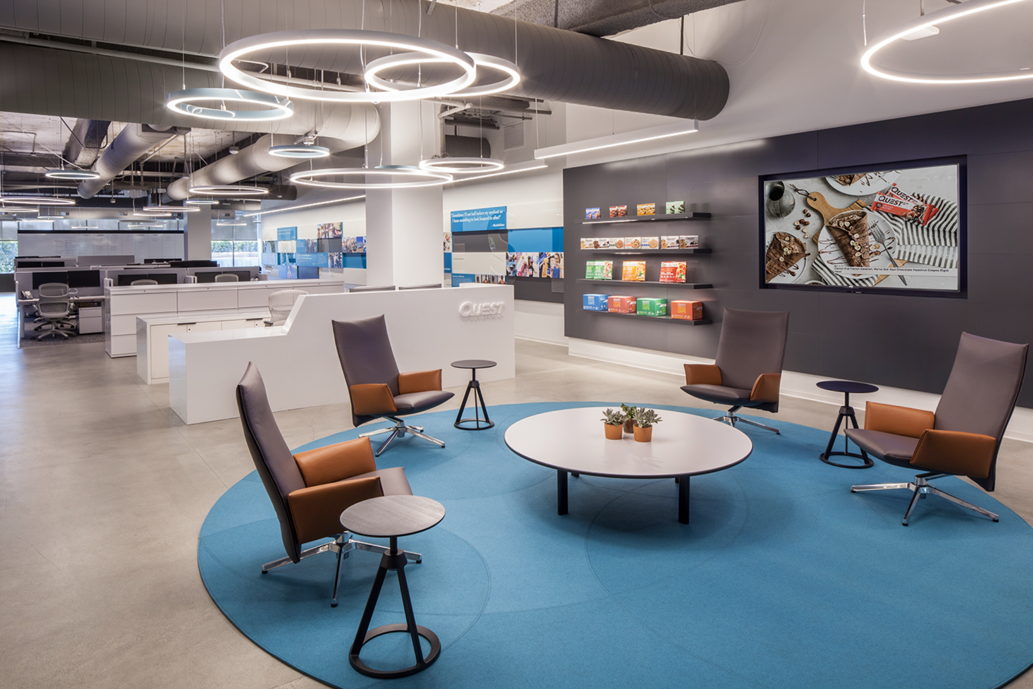
The initial packaging refresh complete, my task was now to extend the look to new product launches like Quest Thin Crust Pizza, and beyond packaging to all branded assets: digital, print, social media, broadcast, and anywhere the Quest brand is presented to consumers.
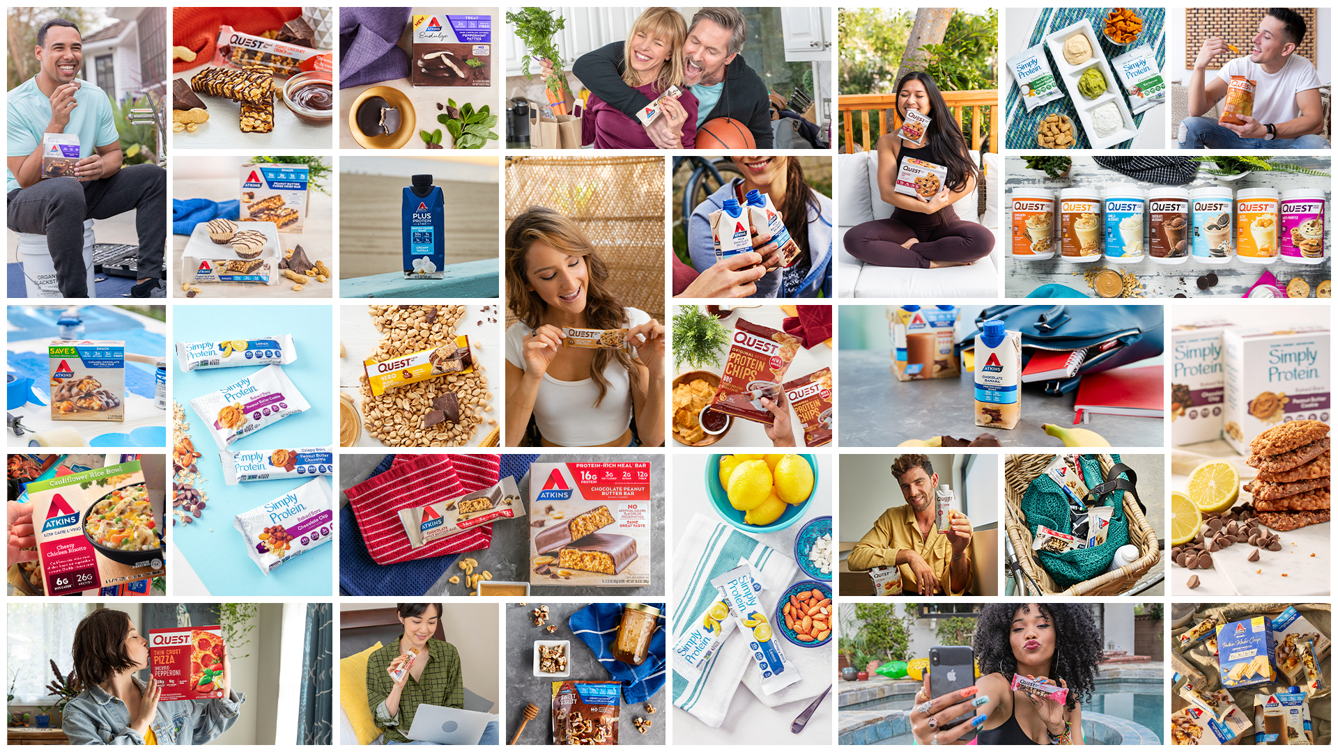
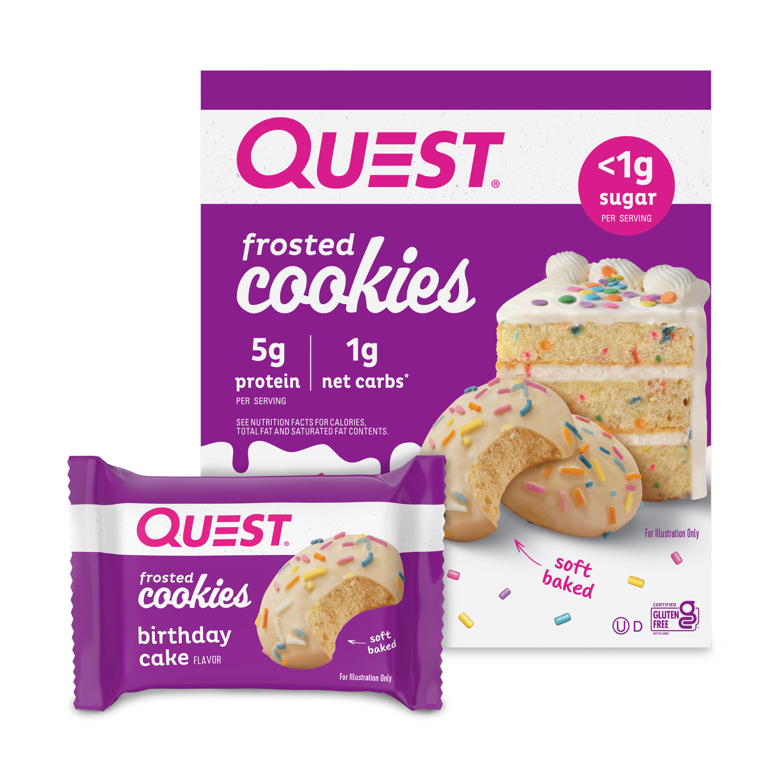
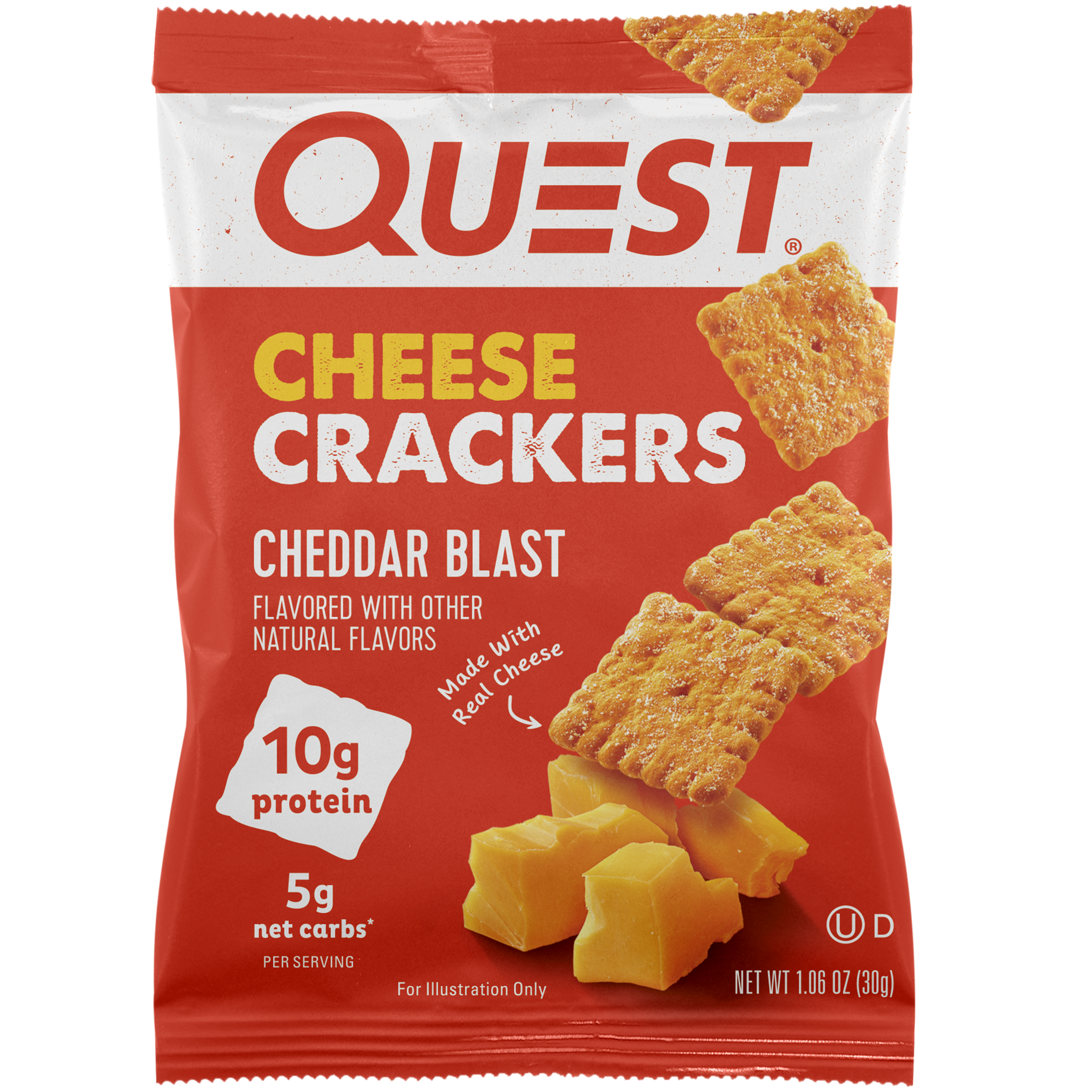
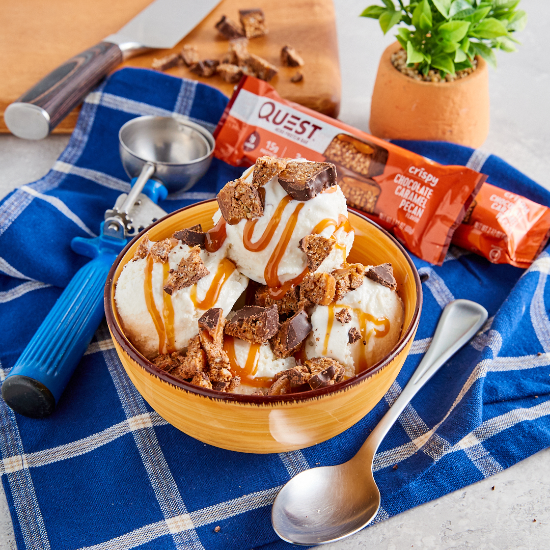
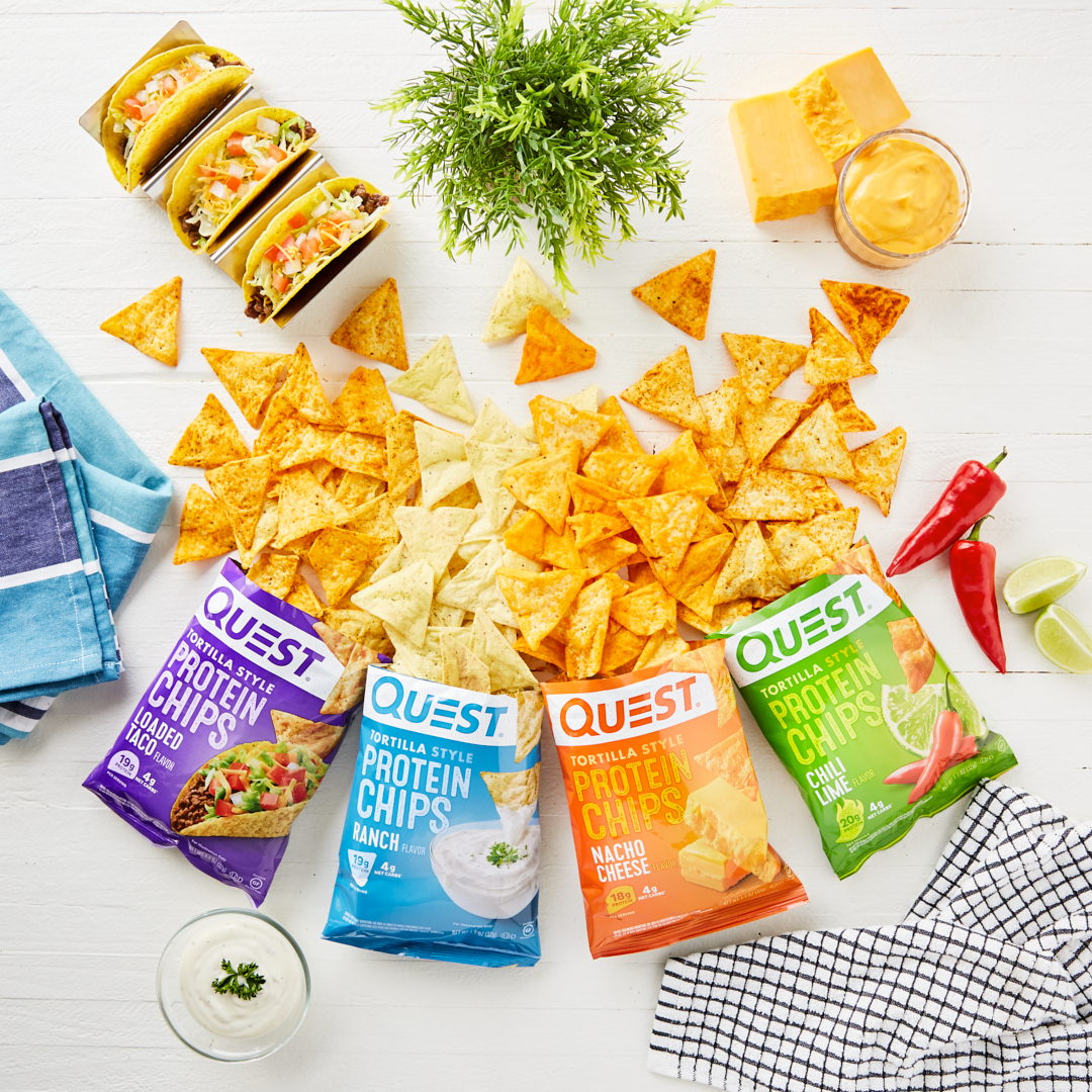
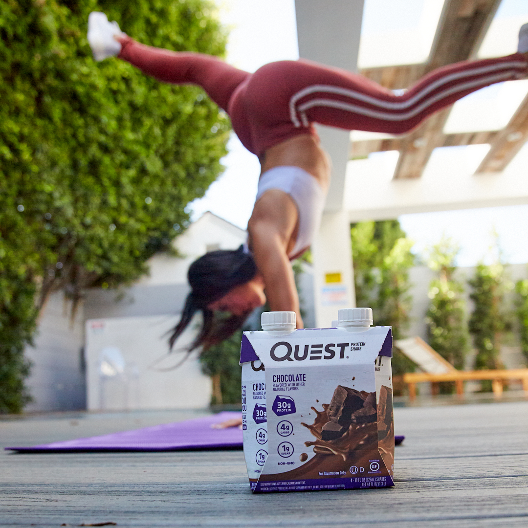
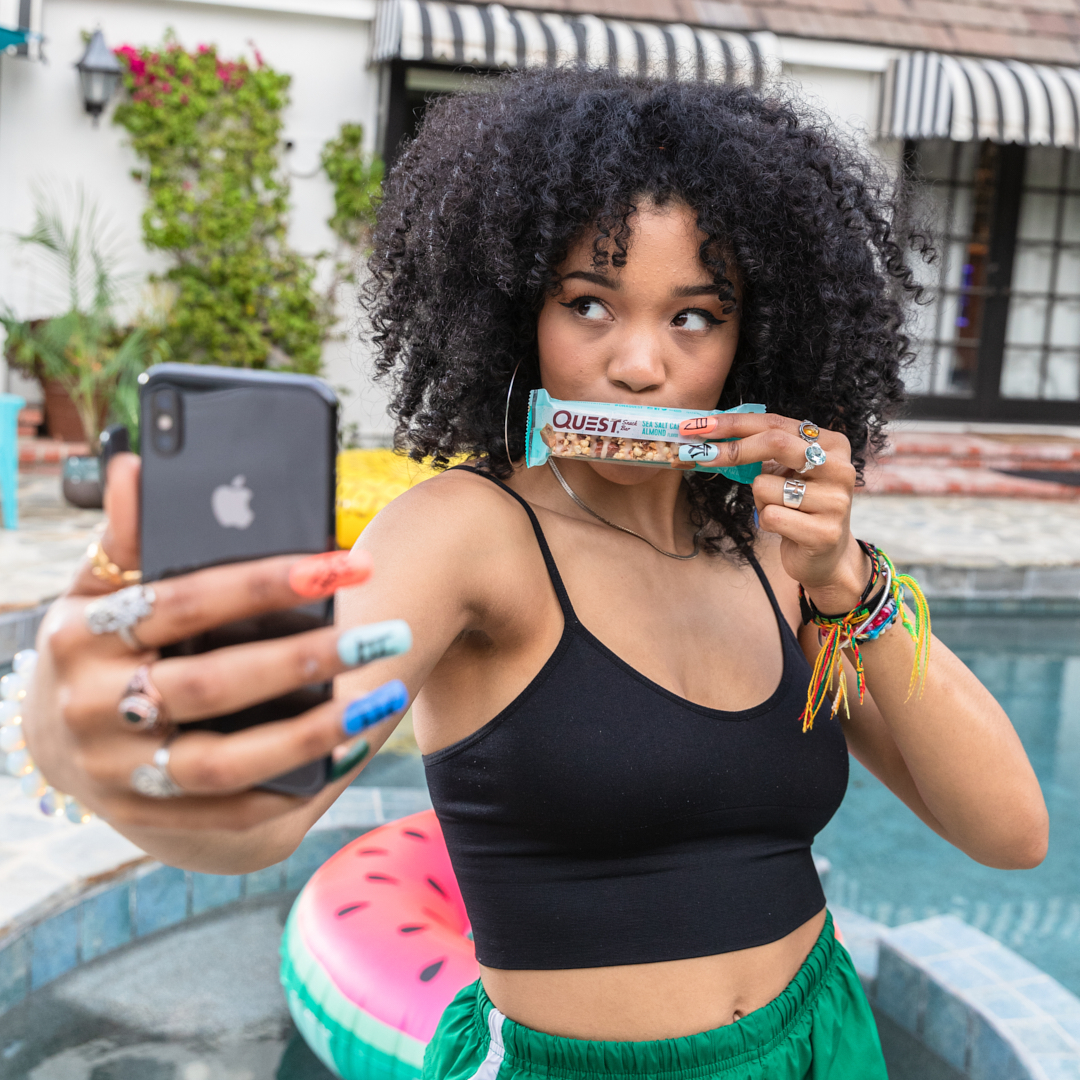
Below I've included various examples of the work that we've produced over the years, but there are literally thousands of pieces of creative in circulation. Across any Quest branding you'll see a strong degree of consistency and cohesiveness, carefully controlled by the in-house agency.
Beyond the look of the brand, we've carefully crafted the tone and personality. Our work is both the face and voice of Quest that has cultivated a hugely passionate and loyal following.
At all times, Quest is approachable, fun, positive, and a supportive partner for anyone who is #onaquest.
In 2020 Quest Nutrition was acquired by the Simply Good Foods Company for $1 billion. Now I'm not saying we contributed to the price tag... but we sure made it look the part.